My game, Aerolith, is out on iPhone. It is a compact arcade-shooter prologue: steal a fighter, escape a prison planet and get through three missions, each ending with a boss. The first App Store version arrived on October 22.
The product page gives the short version, but the structure is worth looking at more closely. A small shooter needs a clear relationship between what the player sees, what their finger controls and what the next few seconds demand.
In Aerolith, dragging steers the fighter and firing happens automatically. That puts movement at the center of the immediate interaction. The player can concentrate on choosing a path through enemy fire rather than repeatedly pressing a fire control.
Automatic fire still leaves plenty to read. The ship has a position, threats have trajectories and pickups create reasons to move somewhere that may be less safe. A good screen lets those relationships become visible quickly enough for a decision.
A short route gives the action a shape
The three missions move from a midnight breakout to a plateau at daybreak and then to a spaceport. That sequence gives the prologue a direction. The player is going somewhere, and each environment marks a stage of the escape.
A boss at the end of each mission creates a distinct interruption in the rhythm. Ordinary waves can establish movement patterns; a larger opponent asks the player to read a more concentrated threat. The contrast is useful even in a short game because it gives progress a recognizable boundary.
The plateau screenshot shows the relationship clearly. The player's smaller turquoise fighter sits below a much larger enemy ship. Purple projectiles stand apart from the brown terrain. The boss's health information stays close to the boss, while the player's status occupies the upper interface.
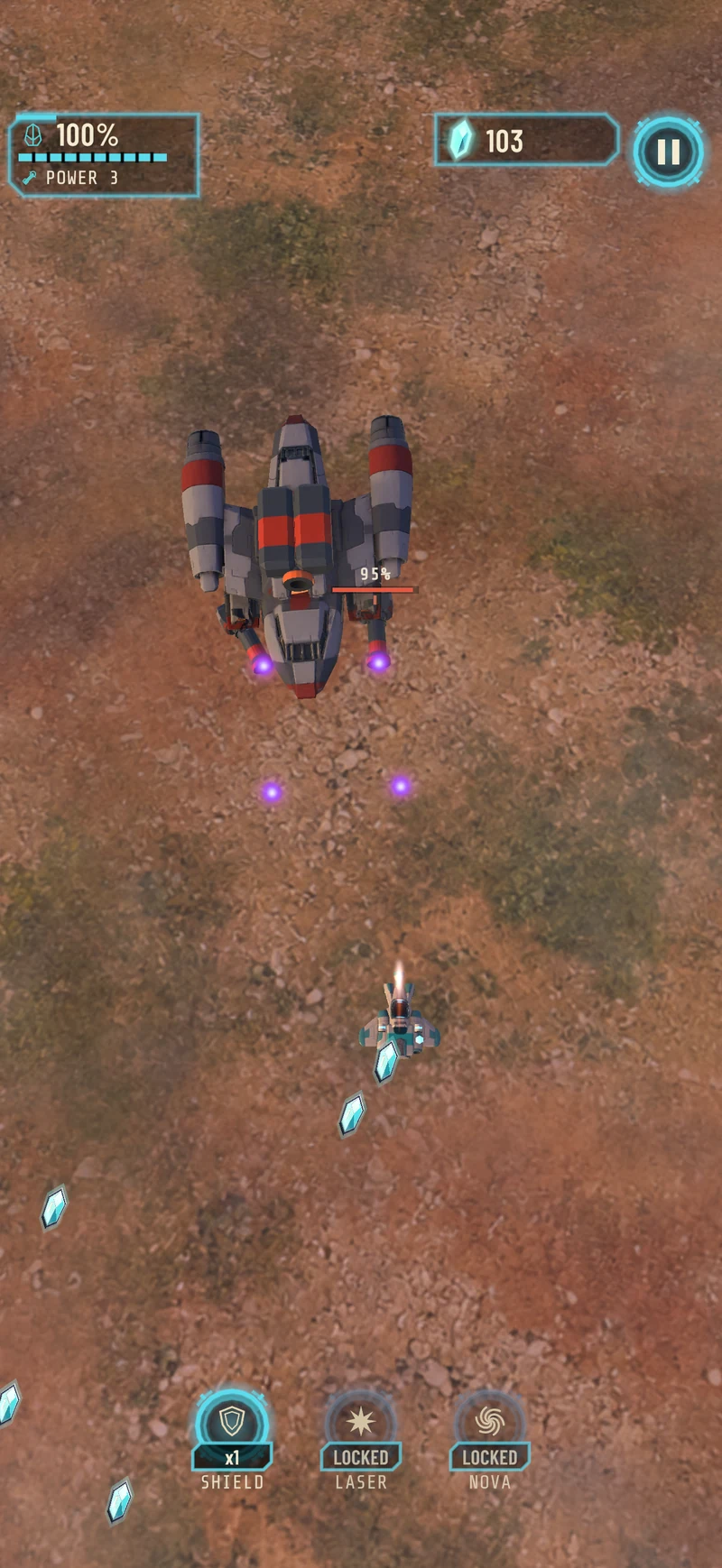
The plateau boss encounter in Aerolith. In-game screenshot from the product page.
The screen has to support several scales of attention. The player needs to locate their fighter immediately, read nearby threats and notice the larger encounter. Terrain adds a sense of travel, but it should not compete with the objects that affect the next movement.
I think that is one of the central disciplines of a small arcade game. More visible detail can make the world richer while making the action harder to read. The useful question is what each element contributes during play, not only how it looks when paused.
Progress outside the immediate encounter
Aerolith shards provide a connection between action and the hangar, where the fighter can be upgraded. All upgrades can be earned through play. Optional purchases exist, but the game can be played offline, without ads or an account.
That arrangement keeps the basic route into the game short. Someone can open it and play without establishing a separate identity or waiting for a social layer to become relevant. Purchases need an App Store connection, while the core play does not depend on one.
For a compact prologue, clear boundaries help. Three missions is a specific amount of content. It gives the player an understandable promise and gives the game a form that can be completed. Calling it a prologue also leaves its scale explicit.
I would judge that small form through the quality of the transitions: how quickly the first action becomes understandable, how an encounter communicates danger, and whether finishing a mission feels like moving along the escape route. Those are more useful questions than whether the feature list is long enough.
Aerolith on the App Store is a small released game with a concrete shape. One ship, three stages and a route out of the prison planet are enough to give the action a reason to continue. The work is making that route clear one screen at a time.